** This post is heavily based on R for Data Science. Please consider to buy that book if you find this post useful.**
First Steps
The mpg Data Frame
The mpg data frame will be used in this section. take a look on it.
library(tidyverse)
head(mpg)
## # A tibble: 6 x 11
## manufacturer model displ year cyl trans drv cty hwy fl class
## <chr> <chr> <dbl> <int> <int> <chr> <chr> <int> <int> <chr> <chr>
## 1 audi a4 1.80 1999 4 auto~ f 18 29 p comp~
## 2 audi a4 1.80 1999 4 manu~ f 21 29 p comp~
## 3 audi a4 2.00 2008 4 manu~ f 20 31 p comp~
## 4 audi a4 2.00 2008 4 auto~ f 21 30 p comp~
## 5 audi a4 2.80 1999 6 auto~ f 16 26 p comp~
## 6 audi a4 2.80 1999 6 manu~ f 18 26 p comp~displ is a car’s engine size, in liters.
hwy, a car’s fuel efficiency on the highway, in miles per gallon (mpg).
Creating a ggplot
Note that ggplot() is an object. The following examples will explain it.
First, let’s make a basic plot on the mpg dataset:
ggplot(data = mpg)
Figure 1: A basic and a blank plot using ggplot.
Why is that so? It’s because you need to specify the x-axis and y- axis of the plot.
Now, let’s plot displ on the x-axis and hwy on the y-axis.
ggplot(data = mpg) +
  geom_point(mapping = aes(x = displ, y = hwy))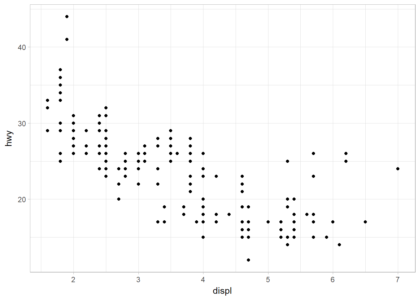
Figure 2: Scatterplot of hwy against disply
Recall that ggplot(data = mpg) creates an empty graph. Then, we add one or more layers to the object ggplot() using + operator.
geom_point() adds a layer of points to your plot, which creates scatterplot.
Each geom function takes a mapping argument. This defines how variables in your dataset are mapped to visual properties. The mapping argument is always paired with aes(). The x and y arguments of aes() specify which variables to map to the x and y-axes.
A Graphing Template
ggplot(data = DATA) +
GEOM_FUNCTION(mapping = aes(MAPPINGS))
Aesthetic Mappings
The class variable of the mpg dataset classifies cars into groups such as compact, midsize, and SUV. We can add a third variable, like class, to a two-dimensional scatterplot by mapping it to an aesthetic.
An aesthetic is a visual property of the objects in your plot. Aesthetics include things like the size, the shape, or the color of your points. Let’s use the word “level” to describe aesthetic properties.
Let’s map the colors of your points to the class variable to reveal the class of each car. To map an aesthetic to a variable, associate the name of the aesthetic (ex: color) to the name of the variable inside aes().
ggplot(data = mpg) +
  geom_point(mapping = aes(x = displ, y = hwy, color = class))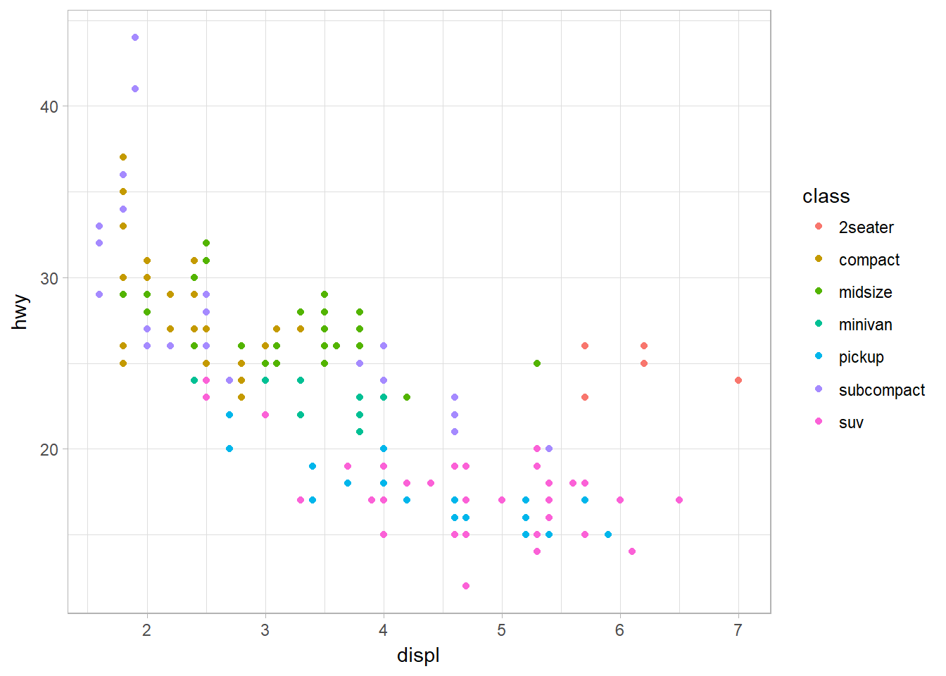
Figure 3: Mapping aethsthetic (color) to a third variable, class.
Now, mapped class to the size aesthetic in the same way. Generally, mapping an unordered variable (class) to an ordered aesthetic (size) is not a good idea because it could be misleading to your audience.
ggplot(data  = mpg) +
  geom_point(mapping = aes(x = displ, y = hwy, size = class))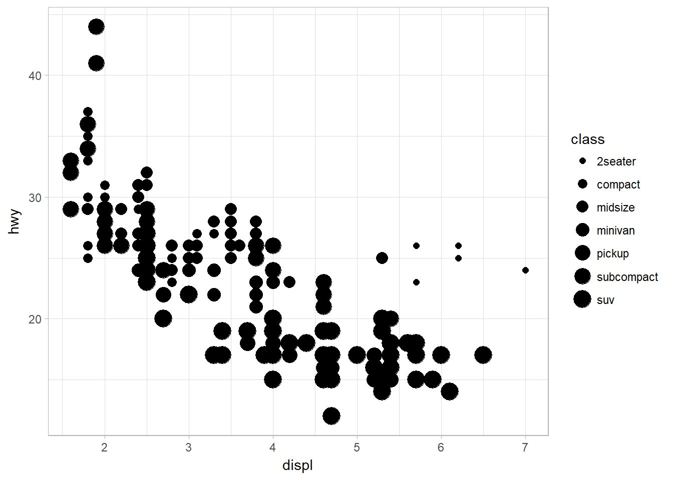
Figure 4: Mapping aethsthetic (size) to a third variable, class
We can also map class to the shape and alpha aesthetic, which controls the transparency of the points, or the shape of the points.
p <- ggplot(data = mpg) +
  geom_point(mapping = aes(x = displ, y = hwy, alpha = class))

q <- ggplot(data = mpg) +
  geom_point(mapping = aes(x = displ, y = hwy, shape = class))

library(gridExtra)
grid.arrange(p,q, ncol = 2)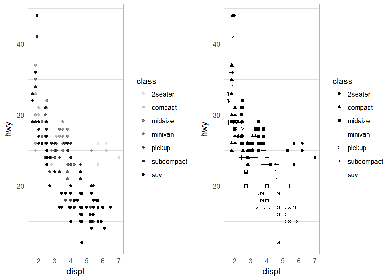
Figure 5: Mapping aethsthetic (shape and alpha) to a third variable, class, to control transparency.
Note that SUV lost its shape because ggplot2 will only use six shapes at a time. By default, additional groups will go unplotted.
Setting the Aesthetic Properties Manually
Let’s try to set the aesthetic properties of the geom manually. For example, we can make all of the points in our plot blue. It can be done by setting the aesthetic by name as an argument of your geom() function, not the aes() function; i.e., it goes outside of aes().
ggplot(data = mpg) +
  geom_point(mapping = aes(x = displ, y = hwy), color = "blue")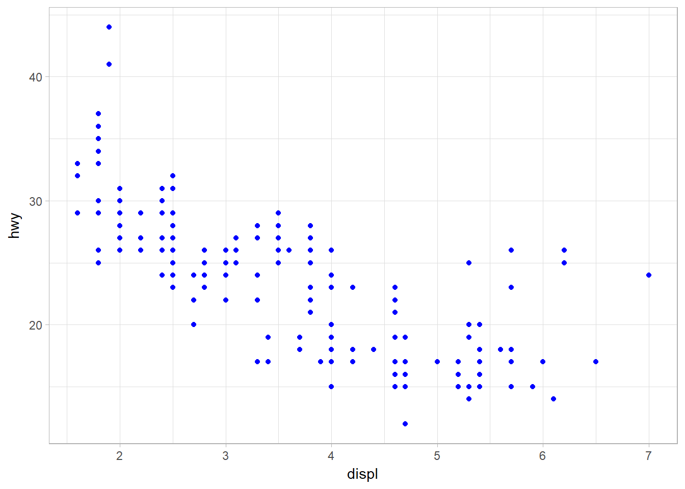
Figure 6: Changing the color of the plot manually.
The following are some values that can be set:
- The name of a color as a character string.
- The size of a point in mm.
- The shape of a point as a number.
Mapping aesthetics to a continous variable
So what would happen when we map a continuous variable to color, size, and shape? Let’s use year as the continuos variable and check it out.
## color
p <- ggplot(data = mpg) +
  geom_point(mapping = aes(x = displ, y = hwy, color = year))

## size
q <- ggplot(data = mpg) +
  geom_point(mapping = aes(x = displ, y = hwy, size = year))

library(gridExtra)
grid.arrange(p,q, nrow = 2)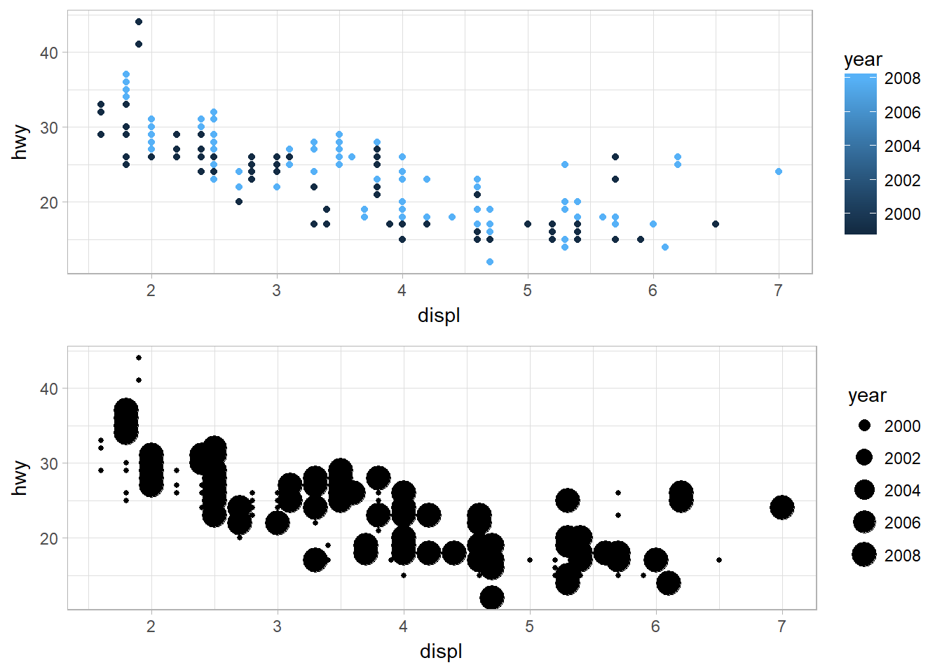
Figure 7: Mapping color and size aesthetics to a continous variable, year.
For shape:
ggplot(data = mpg) +
  geom_point(mapping = aes(x = displ, y = hwy, shape = year))
As for color, it shows a range of colors. The same thing is happening on the size. However, a warning message stating that a continuous variable can not be mapped to shape.
Mapping the same variable to multiple aesthetics
You can also map the same variable to multiple aesthetics.
ggplot(data = mpg) +
  geom_point(mapping = aes(x= displ, y = hwy , color = class, size = class, shape = class))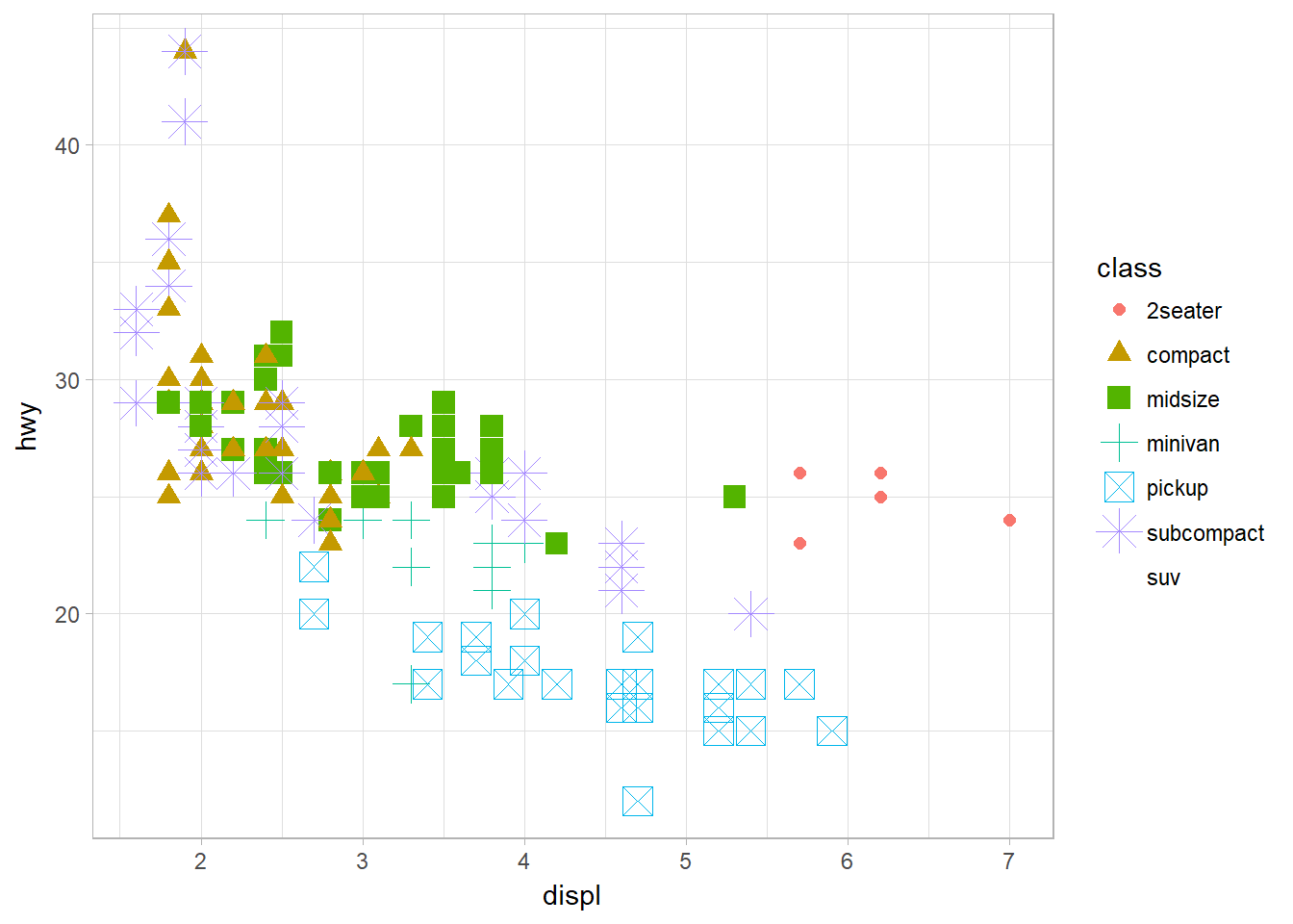
Figure 8: Mapping the same variable to multiple aesthethics
Mapping aethetics to a non-variable
How about map an aesthetic to something other than a variable name, like aes(color = displ < 5)?
ggplot(data = mpg) +
  geom_point(mapping = aes(x = displ, y = hwy, color = displ<5))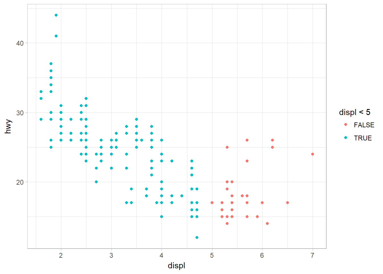
Figure 9: Mapping aesthetics using logical expression
Common Problems
- Correct the misplaced character such as pairing up the
" "and( ). - Incomplete expression: the left-hand side of your console has a
+. This means that R is waiting for you to finish the expression. - Use help function. ?function_name or selecting the function name and pressing F1 in RStudio. You can skip down to the examples and look for code that matches what you’re trying to do.
- Carefully read the error message. Sometimes the answer can be found there.
- Google: trying googling the error message, as it’s likely someone else has had the same problem, and has received help online.
- One common problem when creating ggplot2 graphics is to put the + in the wrong place: it has to come at the end of the line, not the start. Prevent:
ggplot(data = mpg)
  + geom_point(mapping = aes(x = displ, y = hwy))