** This post is heavily based on R for Data Science. Please consider to buy that book if you find this post useful.**
We always look for variations and covariations of variables during EDA.
Variation
Visualizations
Categorical Variable – Bar chart with geom_bar
library(tidyverse)
library(ggplot2)

ggplot(data = diamonds) +
  geom_bar(mapping = aes(x = cut))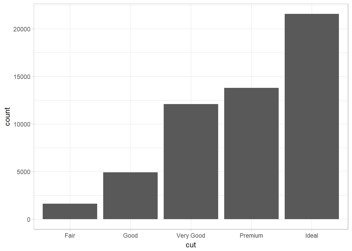
Continuous Variable
Histogram with geom_histogram
ggplot(data = diamonds) +
  geom_histogram(mapping = aes(x = carat), binwidth = 0.5)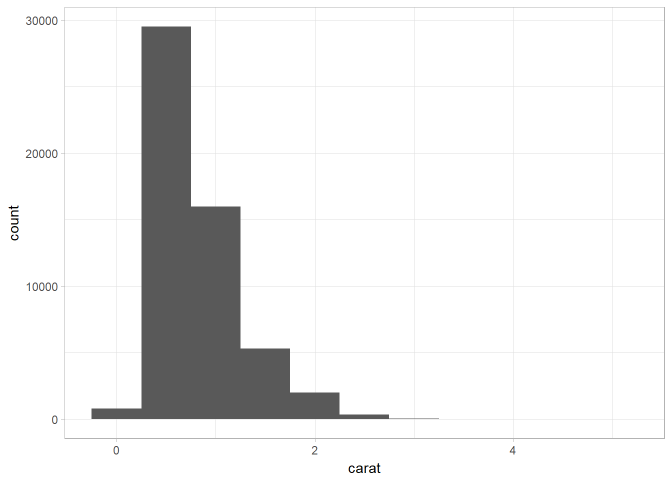
Overlapping Histograms using geom_freqpoly
Problem: unable to compare directly between categories since they are not having the same number of instances within a category. Add in y = ..density.. in the aes() to create density plot.
ggplot(data = smaller, mapping = aes(x = carat, color = cut)) +
  geom_freqpoly(binwidth = 0.1)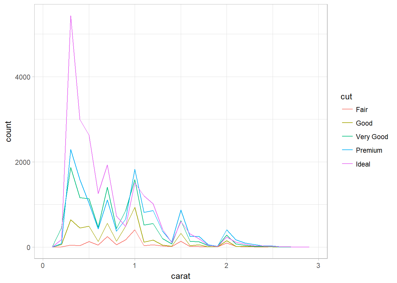
Typical values
Look for anything unexpected:
- Which values are the most common? Why?
- Which values are rare? Why? Does that match your expectations?
- Can you see any unusual patterns? What might explain them?
In general, clusters of similar values suggest that subgroups exist in your data. To understand the subgroups, ask:
- How are the observations within each cluster similar to each other?
- How are the observations in separate clusters different from each other?
- How can you explain or describe the clusters?
- Why might the appearance of clusters be misleading?
Unusual Values
Outliers are observations that are unusual; data points that don’t seem to fit the pattern.
Repeat your analysis with and without the outliers:
- If they have minimal effect on the results, and you can’t figure out why they’re there, replace them with missing values and move on.
- If they have a substantial effect, you shouldn’t drop them without justification. You’ll need to figure out what caused them (e.g., a data entry error) and disclose that you removed them in your write-up.
Zoom in into plot without resetting xlim and ylim with coord_cartesian
coord_cartesian simply zooms in on the area specified by the limits. The calculation of the histogram is unaffected. However, the xlim and ylim functions first drop any values outside the limits, then calculates the histogram, and draws the graph with the given limits.
ggplot(diamonds) +
  geom_histogram(mapping = aes(x = y), binwidth = 0.5) + ## y is one of the vars
  coord_cartesian(ylim = c(0, 50)) ## vs ylim(c(0, 50))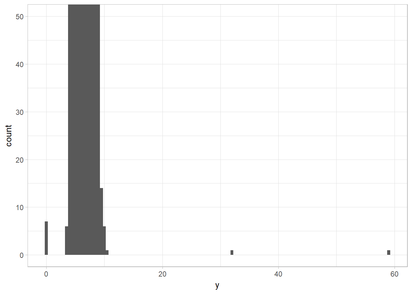
Missing Values
The missing values in a histogram are removed with warnings while NAs in bar chart are treated as another bar (i.e., another category). The NAs are removed prior to performing calulation (i.e., mean, sum,…). May na.rm is not TRUE, the functions return NA.
Rowwise Deletion vs Replacing with NAs
Two options when you encountered missing values in your data:
- Drop the entire row with the strange values. This is not recommended because one it is a waste to remove other variables’ measurements because of one invalid variable value. Besides, a large number of data removal will handicap your analyses when you have a low quality data.
- Instead, I recommend replacing the unusual values with missing values. The easiest way to do this is to use mutate() to replace the variable with a modified copy. You can use the ifelse() function to replace unusual values with NA.The arguments for
ifelseareifelse(test, value if true, value if false):
# Replace with NA
diamonds2 <- diamonds %>%
    mutate(y = ifelse(y < 3 | y > 20, NA, y))
Suppressing ggplot2 NAs removal warnings with na.rm = TRUE
ggplot2 always warns the NA values that it removes prior to plotting,
ggplot(data = diamonds2, mapping = aes(x = x, y = y)) +
  geom_point(na.rm = TRUE)
Comparing missing vs non-missing values by creating new variable using is.na()
Ex: compare the scheduled departure times for cancelled and noncancelled times.
nycflights13::flights %>%
  mutate(
    cancelled = is.na(dep_time),
    sched_hour = sched_dep_time %/% 100,
    sched_min = sched_dep_time %% 100,
    sched_dep_time = sched_hour + sched_min / 60
  )
## # A tibble: 336,776 x 22
## year month day dep_time sched_dep_time dep_delay arr_time
## <int> <int> <int> <int> <dbl> <dbl> <int>
## 1 2013 1 1 517 5.25 2. 830
## 2 2013 1 1 533 5.48 4. 850
## 3 2013 1 1 542 5.67 2. 923
## 4 2013 1 1 544 5.75 -1. 1004
## 5 2013 1 1 554 6.00 -6. 812
## 6 2013 1 1 554 5.97 -4. 740
## 7 2013 1 1 555 6.00 -5. 913
## 8 2013 1 1 557 6.00 -3. 709
## 9 2013 1 1 557 6.00 -3. 838
## 10 2013 1 1 558 6.00 -2. 753
## # ... with 336,766 more rows, and 15 more variables: sched_arr_time <int>,
## # arr_delay <dbl>, carrier <chr>, flight <int>, tailnum <chr>,
## # origin <chr>, dest <chr>, air_time <dbl>, distance <dbl>, hour <dbl>,
## # minute <dbl>, time_hour <dttm>, cancelled <lgl>, sched_hour <dbl>,
## # sched_min <dbl>Covariation
It is the tendency for the values of two or more variables to vary together in a related way.
A Categorical and Continuous Variable
It is used to explore the distribution of a continuous variable broken down by a categorical variable.
Density Plot with geom_freqpoly
Problem of faceted histogram: unable to compare directly between categories since they are not having the same number of instances within a category. Density plot ensures that we are comparing categories in a same scale – density.
ggplot(
  data = diamonds,
    mapping = aes(x = price, y = ..density..)
  ) +
  geom_freqpoly(mapping = aes(color = cut), binwidth = 500)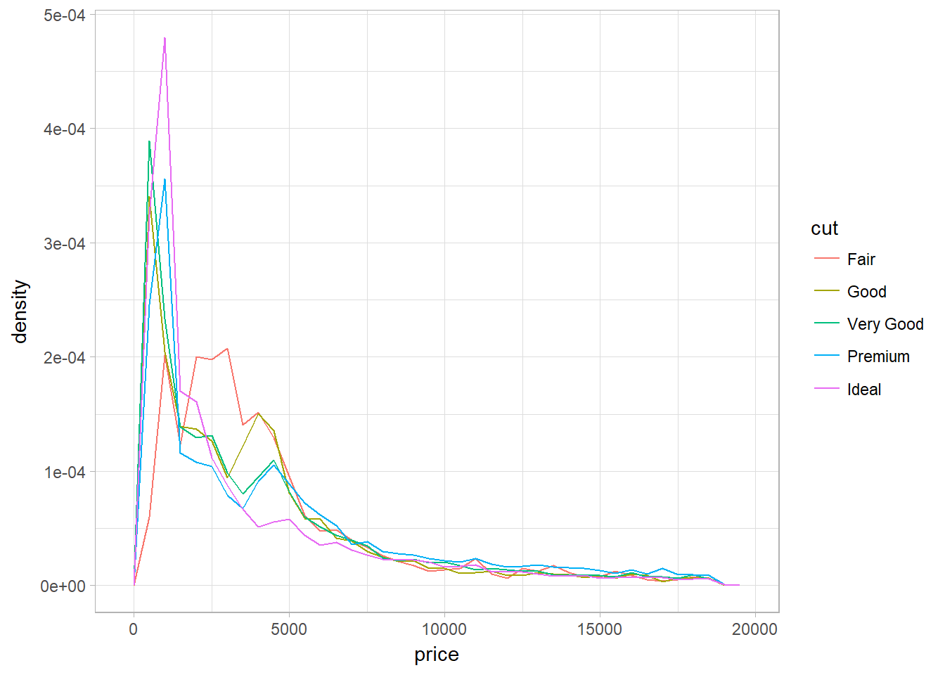
Large Dataset
Letter-value plot (for large dataset|instead of boxplot) using geom_lv
The boxes of the letter-value plot (lvplot) correspond to many more quantiles. They are useful for larger datasets because
- larger datasets can give precise estimates of quantiles beyond the quartiles, and
- in expectation, larger datasets should have more outliers (in absolute numbers).
library(lvplot)
ggplot(diamonds, aes(x = cut, y = price)) +
  geom_lv()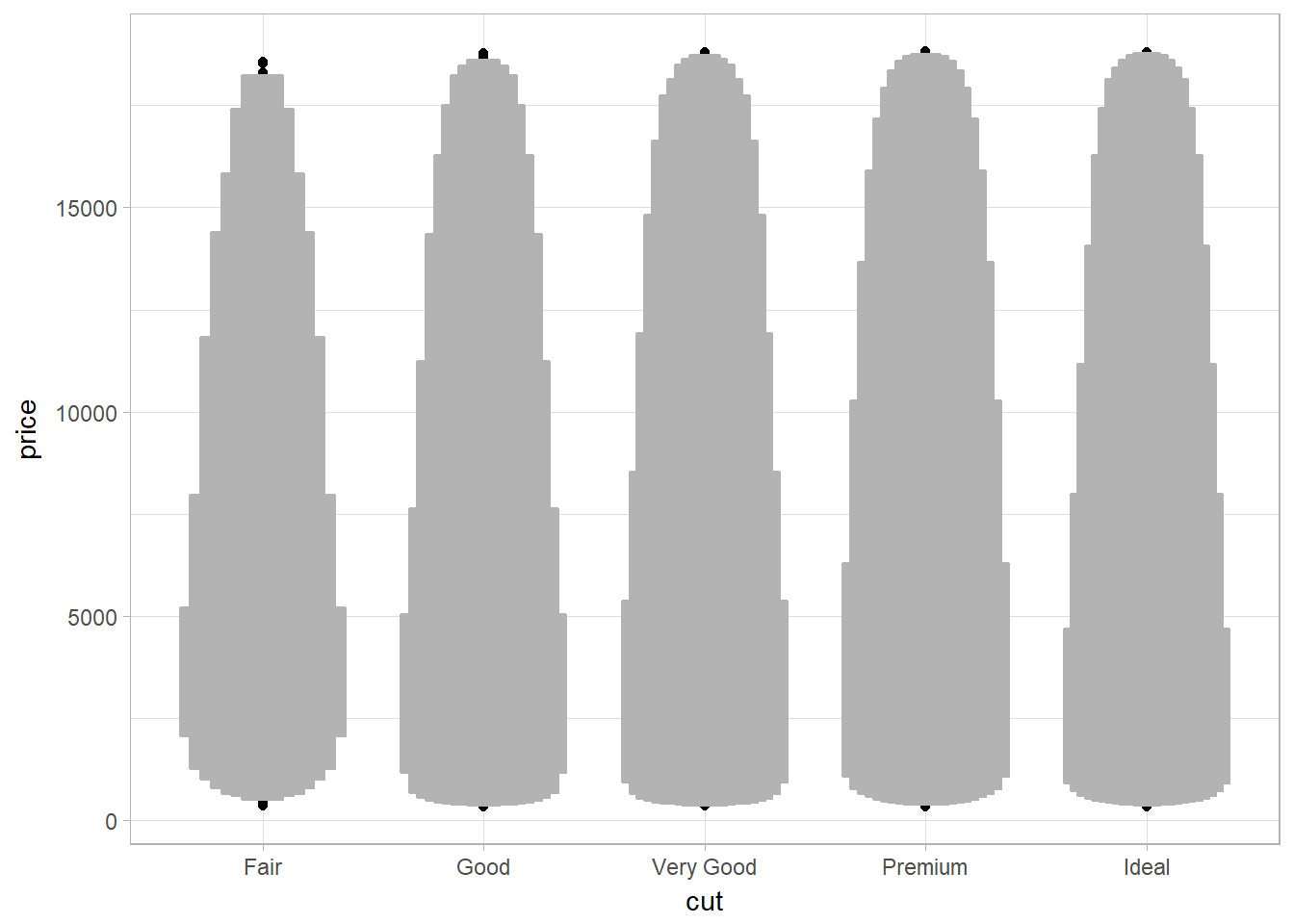
Violin plot (to show distributions) using geom_violin
A violin plot is a hybrid of a box plot and a kernel density plot, which shows peaks in the data.
ggplot(data = diamonds, mapping = aes(x = cut, y = price)) +
  geom_violin() +
  coord_flip()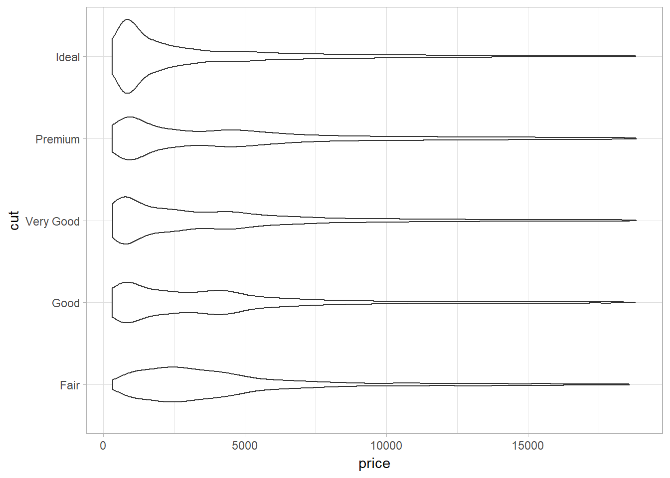
Small Dataset
Boxplot (for small dataset) using geom_boxplot
- Interquantile range (IQR) = 25 to 75th percentile. These are the two lines of the box in a boxplot.
- Median is the 50th percentile.
- Visual points are outliers. They fall beyond 1.5 x IQR.
- The whisker (or a line) is the range of the non-outliers.
- Problem 1: tend to display a prohibitively large number of “outlying values” and is more suitable for small dataset. Use letter-value plot for large dataset.
- Problem 2: Limiting for multimodal distributions (those with multiple peaks).
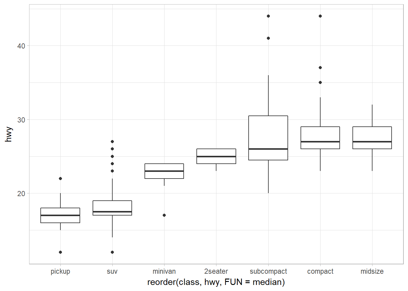
ggplot(data = mpg, mapping = aes(x = class, y = hwy)) +
  geom_boxplot()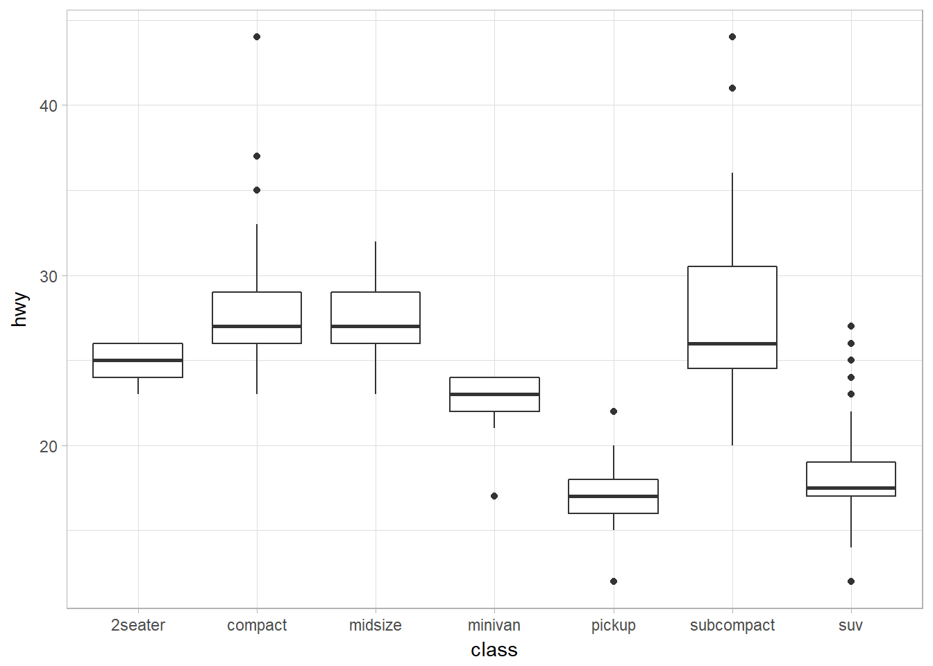
Reorder the levels of categorical variables using reorder()
reorder(factor_to_be_ordered, values_that_decide_the order, FUN)
To make the trend easier to see, we can reorder class based on the median value of hwy:
ggplot(data = mpg) +
  geom_boxplot(
    mapping = aes(
      x = reorder(class, hwy, FUN = median),
      y = hwy
  )
)
Horizontal boxplot using coord_flip or geom_boxploth
The first one using coord_flip.
ggplot(data = mpg) +
  geom_boxplot(
    mapping = aes(
      x = reorder(class, hwy, FUN = median),
      y = hwy
  )
) +
  coord_flip()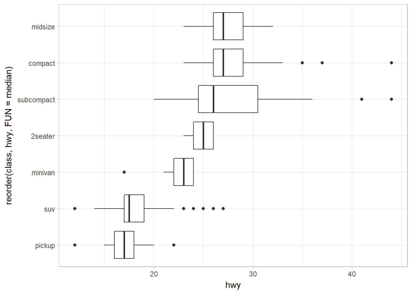
The second uses geom_boxploth from ggstance. The only difference is the aesthethics of x and y: it is flipped when we use coord_flip().
library(ggstance)
ggplot(data = mpg) +
  geom_boxploth(
    mapping = aes(
      x = hwy,
      y = reorder(class, hwy, FUN = median)
  )
)
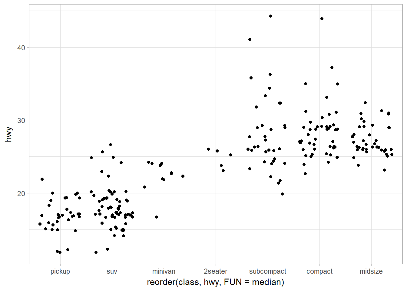
Jitter points using geom_jitter
ggplot(data = mpg) +
  geom_jitter(mapping = aes(x = reorder(class, hwy, FUN = median),
                              y = hwy)
                )
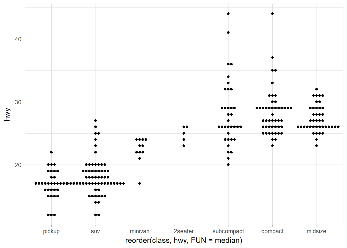
Jitter + Violin plot using geom_quasirandom
There are several methods available:
- quasirandom
- pseudorandom
- tukey
- tukeyDense
- frowney
- smiley
library(ggbeeswarm)
## Quasirandom default method -- quasirandom
ggplot(data = mpg) +
  geom_quasirandom(mapping = aes(x = reorder(class, hwy, FUN = median),
                                 y = hwy))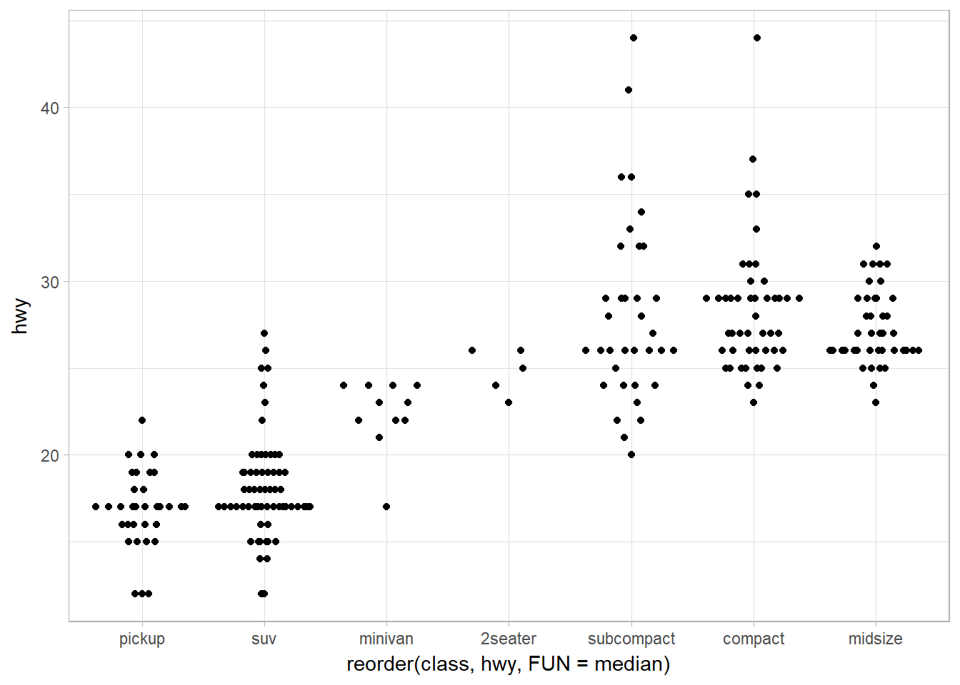
## Tukey
ggplot(data = mpg) +
  geom_quasirandom(mapping = aes(x = reorder(class, hwy, FUN = median),
                                 y = hwy),
                   method = "tukey")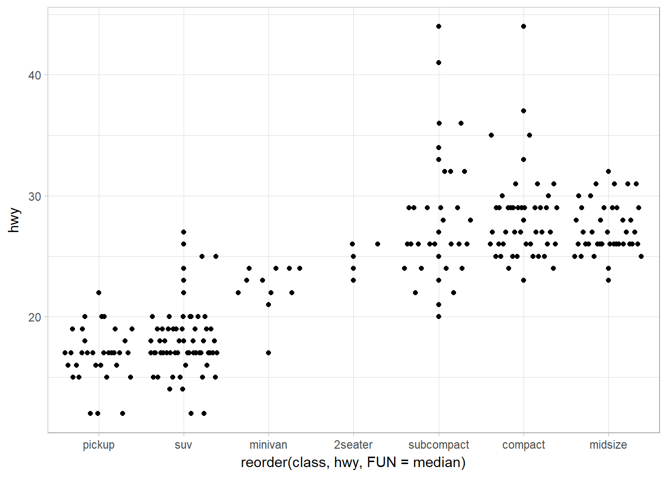
Offsetting (sideway) the violin plot using geom_beeswarm
library(ggbeeswarm)
ggplot(data = mpg) +
  geom_beeswarm(mapping = aes(x = reorder(class, hwy, FUN = median),
                              y = hwy)
                )
Two Categorical Variables
It’s usually better to use the categorical variable with a larger number of categories or the longer labels on the y axis. If at all possible, labels should be horizontal because that is easier to read.
Bubble Chart with geom_count
To visualize the covariation between categorical variables, you’ll need to count the number of observations for each combination. One way to do that is to rely on the built-in geom_count():
ggplot(data = diamonds) +
  geom_count(mapping = aes(x = cut, y = color))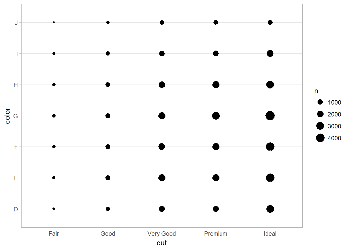
Heatmap Plotting with geom_tile
Another approach is to compute the count with dplyr, then visualize with geom_tile() and the fill aesthetic:
diamonds %>%
  count(color, cut) %>%  ## count(tbl, vars_to_group_by)
  ggplot(mapping = aes(x = color, y = cut)) +
    geom_tile(mapping = aes(fill = n))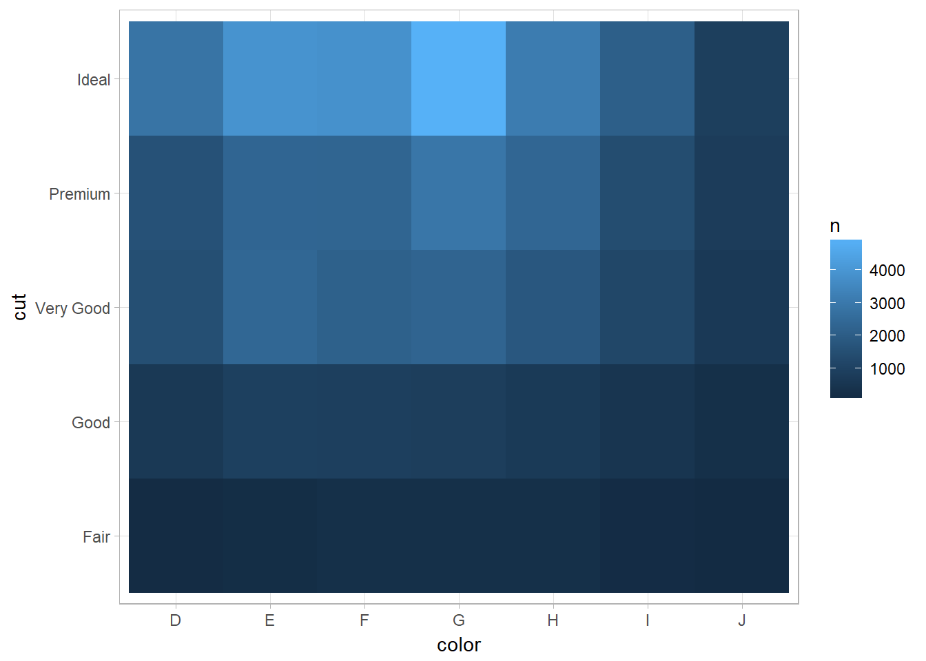
You can also use scale_fill_viridis from the viridis package to fill the color of legend:
library(viridis)
diamonds %>%
  count(color, cut) %>%
  group_by(color) %>%
  mutate(prop = n/ sum(n))%>%
    ggplot(mapping = aes(x = color, y = cut)) +
      geom_tile(mapping = aes(fill = prop)) +
      scale_fill_viridis(limits = c(0,1)) +
      # using scale_fill_continuous(limits = c(0,1)) will not change the fill color
      labs(x = "Diamond color", fill = "Proportion")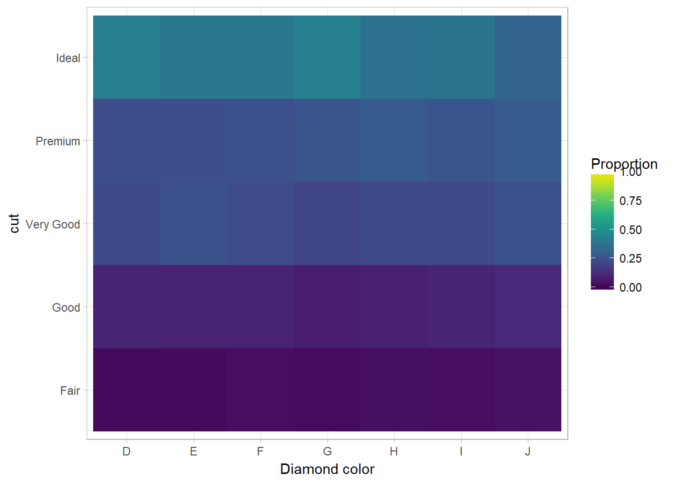
If the categorical variables are unordered, you might want to use the seriation package to simultaneously reorder the rows and columns in order to more clearly reveal interesting patterns. For larger plots, you might want to try the d3heatmap or heatmaply packages, which create interactive plots.
Two Continuous Variables
Scatterplot using geom_point
ggplot(data = diamonds) +
  geom_point(mapping = aes(x = carat, y = price))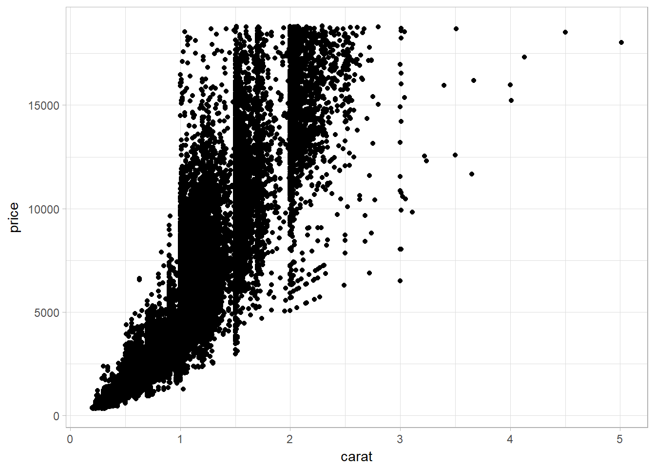
Large dataset problems and solutions
Scatterplots become less useful as the size of your dataset grows, because points begin to overplot, and pile up into areas of uniform black (as in the preceding scatterplot).
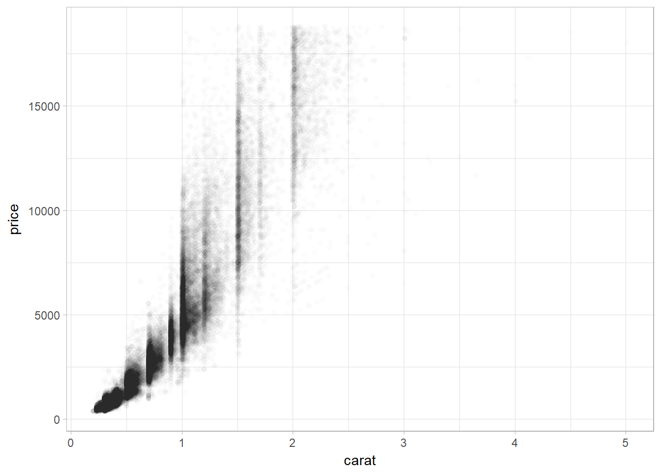
Using alpha aesthethics in geom_point
ggplot(data = diamonds) +
  geom_point(
    mapping = aes(x = carat, y = price),
    alpha = 1 / 100
  )
Using Bins
geom_bin2d() and geom_hex() divide the coordinate plane into 2D bins and then use a fill color to display how many points fall into each bin. geom_bin2d() creates rectangular bins. geom_hex() creates hexagonal bins.
Using bin with geom_bin2d()
ggplot(data = smaller) +
  geom_bin2d(mapping = aes(x = carat, y = price))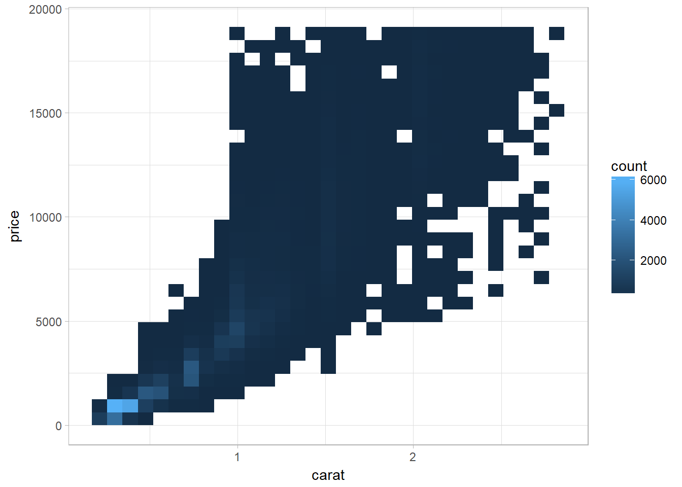
Using bin with geom_hex()
# install.packages("hexbin") # this is needed for geom_hex()
library (hexbin)
ggplot(data = smaller) +
  geom_hex(mapping = aes(x = carat, y = price))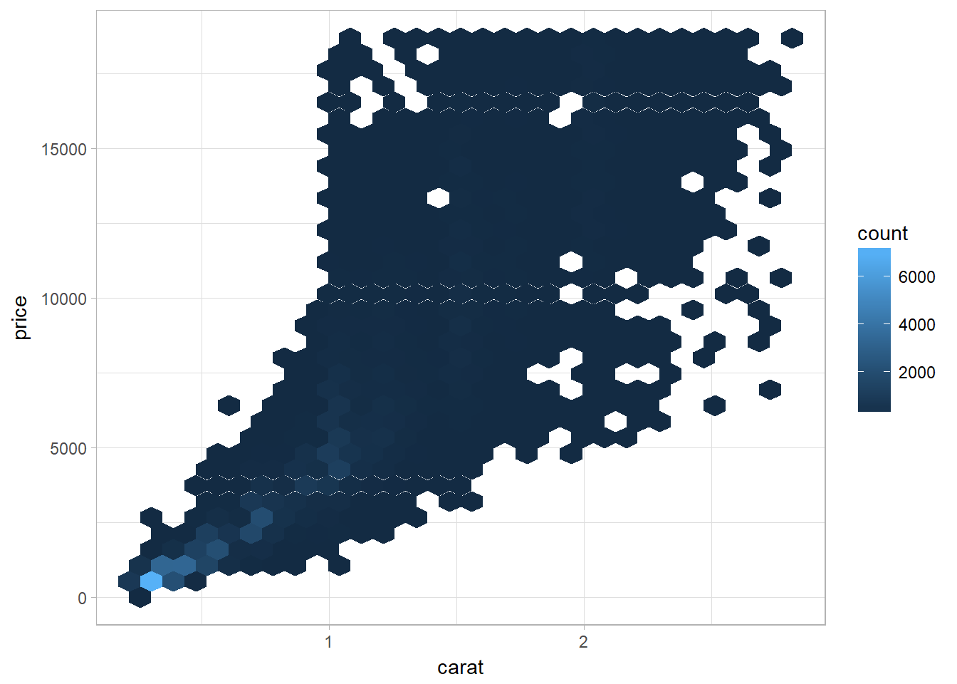
Bin by breaking continuous into categorical variable
Using cutwidth to bin
Use cutwidth(x, width) to break x into bins of width width. Then use visualization technique of a continuous and categorical variable combination.
ggplot(data = smaller, mapping = aes(x = carat, y = price)) +
  geom_boxplot(mapping = aes(group = cut_width(carat, 0.1)),varwidth = TRUE)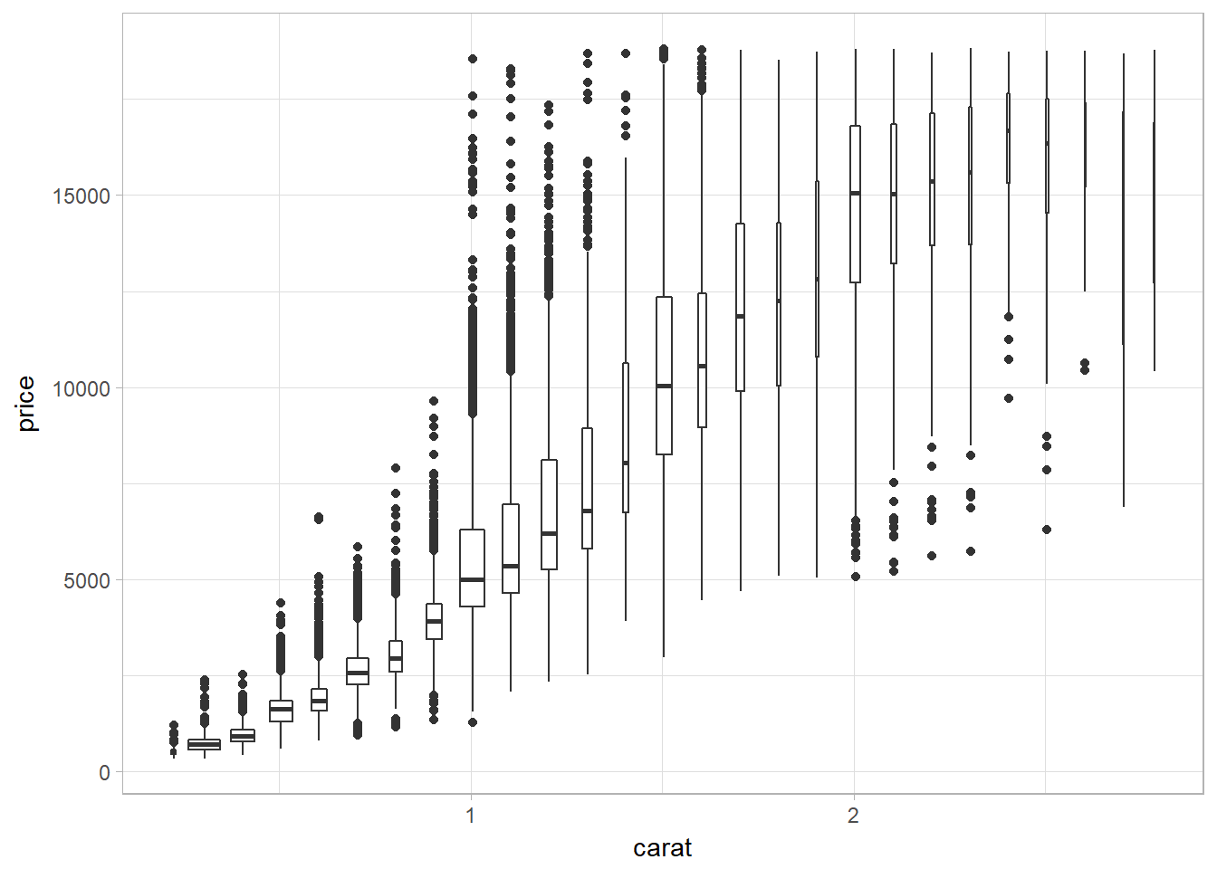
The problem of using cutwidth appears when the data is not uniformly distributed. Setting varwidth = TRUE ensures that the size of boxplot reflects the amount of points in a particular bin.
Using cutnumber to bin
cut_number(x, n) makes n groups with (approximately) equal numbers of observations. This displays a same amount of points in each bin.
ggplot(data = smaller, mapping = aes(x = carat, y = price)) +
  geom_boxplot(mapping = aes(group = cut_number(carat, 20)))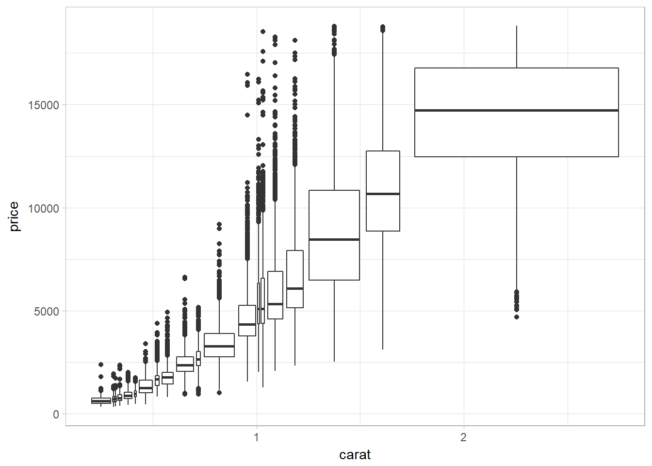
Patterns and Models
Patterns can reveal covariation while models are tools for extracting patterns out of data.
If you spot a pattern in your data, ask yourself:
- Could this pattern be due to coincidence (i.e., random chance)?
- How can you describe the relationship implied by the pattern?
- How strong is the relationship implied by the pattern?
- What other variables might affect the relationship?
- Does the relationship change if you look at individual subgroups of the data?